
Machine Learning, supervised learning, clustering, data cleansing, these are all concepts of data science. Data Science studies the field of gaining insights from both structured and unstructured data. For data scientists, it is critical to have the right skills to collect data and turn the data into meaningful insights. A good way to turn data into a meaningful ‘something’ is to visualize data. Data visualization refers to the graphical representation of data. There are many tools to visualize data. Python has become the most popular choice for data science.
General: Data Science in a Venn Diagram
Data science includes 3 major disciplines:
- Math & Statistics;
- Programming;
- Business Intelligence.
Aside from Mathematical skills, a data scientist must become familiar with programming languages, such as Python, and needs to have a good understanding of what is going on ‘in the business’. The difference with RStudio is that Python provides a more general-purpose language than RStudio. RStudio is mainly developed to do statistical analysis. Generally, Python supports all kinds of data formats, such as CSVs, JSON files, regular text files, etc. Python uses different libraries to execute data analysis, such as Pandas, NumPy, Matplotlib, and Seaborn.

Python Libraries: Data Visualization
Up until today, Python has approximately 137,000 libraries and approximately 198,000 packages, including all functions to write codes. The most important libraries for data science include Pandas, NumPy, SciPy, Matplotlib, Seaborn, and Scikit-Learn. Pandas allows us to examine data structures and it is used for data frames. NumPy has been created to work with numerical functions, arrays and matrices. In data visualization, Matplotlib and Seaborn are the most common packages. These packages are used for plotting.
Matplotlib
Matplotlib is the most popular package to plot graphs. It enables us to make line charts, scatterplots, histograms, boxplots, etc. The package is an extension of NumPy and works together with NumPy. To start plotting, you should import the packages first. The ‘label’ plt has been included in front of the command when starting the code.
#import packages
import numpy as np
import matplotlib as mpl
import matplotlib.pyplot as plt
Seaborn
Seaborn is a Python package that is based on Matplotlib. The package provides a higher-level interface for plotting attractive charts. To start plotting with Seaborn, you should import the package first. Generally, all packages are imported when starting the code. The ‘label’ sns has been included in front of the command when starting the code.
#import packages
import seaborn as sns
Plotting in python
There are many ways to visualize data, for example in line charts, pie charts, histograms, bar charts, or scatterplots. Here are some examples of how to create a chart with Python. To show the chart, you should use the following code:
#Show plot
plt.show()
Line Chart
A line chart often shows a trend in data, for example how do the numbers develop over time. A line chart could be useful in time series analysis. Here’s a simple example of how to make a line chart with Python.
Example:
#Create a data frame first
data = {'Month': ['May','June', 'July', 'August', 'September'], 'Holiday Packages': ['120','200','250','225','175']}
df = pd.DataFrame(data,columns=['Month','Holiday Packages'])
print(df)

#describe data
#data types will result in an object
print(df.dtypes)

#change data types
df['Month'] = df['Month'].astype(str)
df['Holiday Packages'] = df['Holiday Packages'].astype(int)

#Line Graph
plt.plot(df['Month'],df['Holiday Packages'])

plt.title("Holiday Packages Sold in Summer")
plt.xlabel("Month")
plt.ylabel("Number of Holiday Packages")

plt.show() 
Pie Chart
A pie chart displays the numerical portion divided into slices. It shows the relative size of each categorical variable. The categorical variables have been displayed as labels in a legend.
Example:
#make a circle diagram
# Creating plot
plt.figure(figsize=(10,10))
plt.pie(df_meat['itemDescription'].value_counts())
plt.legend(label, loc = "upper right")
plt.tight_layout()
plt.title("Groceries Shopping: Meat Products")

# show plot
plt.show() 
Histogram
Histograms how the distribution of numerical data. It counts the number of occurrences within a certain category. Here’s an example code of how to make a histogram with Python.
Example:
#show the distribution of spending score

plt.hist(df["Spending Score (1-100)"])
plt.xlabel("Spending Score")
plt.ylabel("Count")
plt.title("Count of Spending Score")

plt.show() 
Bar Chart
A bar chart is slightly different from a histogram. A bar chart contains categorical data. Categorical variables are also named discrete variables, which can only take on a finite number of values. Bar charts can be plotted vertically and horizontally, and the graph shows a comparison between 2 or more discrete variables.
Example:
#Bar Chart
sns.barplot(df['Month'],df['Holiday Packages'],data=df)

plt.title("Holiday Packages Sold in Summer")
plt.xlabel("Month")
plt.ylabel("Number of Holiday Packages")

plt.show() 
Boxplot
A boxplot provides an overview of how data is distributed. The plot displays the minimum, median, and maximum value. From a boxplot, you can derive how tightly data has been grouped and how data is skewed. The median value is the middle value of the dataset, and it does not necessarily equal the mean value.
Example:
#make a boxplot
men = df[df['Gender'] == 'Male']
women = df[df['Gender'] == 'Female']

dfTest = pd.DataFrame(df,columns=['Gender', 'Annual Income (k$)'])
dfTest.boxplot(by=['Gender'],sym = '', figsize = [6,6])

plt.show() 
Scatterplot
A scatterplot shows the relationship between 2 numerical, or continuous, variables. Each dot represents one observation. It is possible to make a scatterplot including multiple dimensions or variables with Python. Here are 2 examples.
Example 1:
#make a scatter plot
dfScatter = pd.DataFrame(df,columns=['Spending Score (1-100)', 'Annual Income (k$)'])

plt.scatter(x='Spending Score (1-100)', y='Annual Income (k$)', data=dfScatter)
plt.title("Mall Customers: spending score and income" , loc='center')
plt.xlabel("Spending Score")
plt.ylabel("Income")

plt.show() 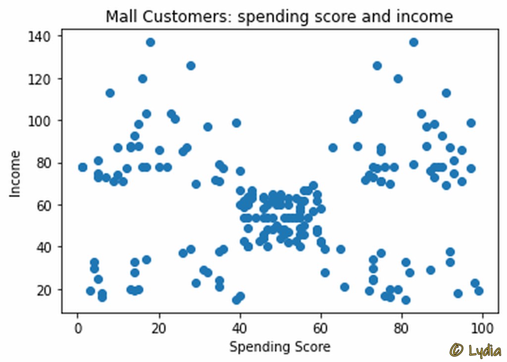
Example 2:
#Scatterplot by gender
#make a scatter plot

#select data first
dfScatter = pd.DataFrame(df,columns=['Spending Score (1-100)', 'Annual Income (k$)', 'Gender'])

#select colors for scatterplot
color_dict = dict({'Male':'blue', 'Female':'red'})

g= sns.scatterplot(x='Spending Score (1-100)', y='Annual Income (k$)', data=dfScatter, hue='Gender', palette =color_dict, legend='full')

plt.title('Mall Customers')
plt.xlabel('Spending Score')
plt.ylabel('Annual Income')
plt.legend(loc='upper right')

plt.show() 
More Information
I am an enthusiastic member of the Kaggle Data Science Community, and I have a keen interest in Data Science. Aside from a randomly created data frame, I have picked the graphs in this article from my Notebook contributions I made at Kaggle.
Would you like to read other interesting articles about data science, also read:
- Data Visualization in RStudio;
- Unsupervised Learning: Clustering Analysis with Mall Customers Data.
